Going from Sum of Squared Errors to the Maximum Likelihood

Greetings, my blog readers!

In this post I will tackle the link between the cost function and the maximum likelihood hypothesis. The idea for this post came to me when I was reading Python Machine Learning by Sebastian Raschka; the chapter on learning the weights on logistic regression classifier. I like this book and strongly recommend it to anyone interested in the field. It has solid Python coding example, many practical insights and a good coverage of what scikit-learn has to offer.

So, in chapter 3, section on  Learning the weights of the logistic cost function, the author seamlessly moves from the need to minimize the sum-squared-error cost function to maximizing the (log) likelihood. I think that it is very important to have a clear intuitive understanding on why the two are equivalent in case of regression. So, let’s dive in!

Sum of Squared Errors

Using notation from [2], if z^{(i)} is a training input variable,  then \phi (z^{(i)}) is the target class predicted by the learning hypothesis \phi. It is clear that we want to minimize the distance between the predicted and the actual class value y^{(i)}, thus the sum-squared-error is defined as \frac{1}{2}\sum_{i}(y^{(i)}-\phi (z^{(i)}))^{2}. The 1/2 in front of the sum is added to simplify the 1st derivative, which is taken to find the coefficients of regression when performing gradient descent. But one could easily define the cost function without the 1/2 term.

The sum-squared error is a cost function. We want to find a classifier (alternatively, a learning hypothesis) that minimizes this cost. Let’s call it J. This is a very intuitive optimal value problem describing what we are after. It is like asking TomTom to find the shortest route to Manchester from London to save money on fuel. No problems! Done. A gradient descend (batch or stochastic) will produce a vector of weights \mathbf{w}, which when multiplied into the matrix of training input variables \mathbf{x} gives the optimal solution. So, the meaning of equation below should now be, hopefully, clear:

J(w)= \frac{1}{2}\sum_{i}(y^{(i)}-\phi (z^{(i)}))^{2}   (1)

The MAP Hypothesis

The MAP hypothesis is a maximum a posteriori hypothesis. It is the most probable hypothesis given the observed data (note, I am using material from chapter 6.2 from [1] for this section). Out of all the candidate hypotheses in \Phi , we would like to find the most probable hypothesis \phi that fits the training data Y well.

h_{MAP} \equiv argmax_{\phi \in \Phi} P(\phi | Y)    (2)

It should become intuitively obvious that, in case of a regression model, the most probable hypothesis is also the one that minimizes J . In (2) we have a conditional probability. Using Bayes theorem, we can further develop it as:

h_{MAP} \equiv argmax_{\phi \in \Phi} P(\phi | Y)

= argmax_{\phi \in \Phi} \frac{P(Y|\phi)P(\phi)}{P(Y)}

= argmax_{\phi \in \Phi} P(Y|\phi)P(\phi)   (3)

P(Y) is the probability of observing the training data. We drop this term because it is a constant and is independent of \phi . P(\phi) is a prior probability of some hypothesis. If we assume that every hypothesis in \Phi is equally probable, then we can drop P(\phi) term from (3) as well (as it also becomes a constant). We are left with a maximum likelihood hypothesis, which is a hypothesis under which the likelihood of  observing the training data is maximized:

h_{ML} \equiv argmax_{\phi \in \Phi} P(Y|\phi)   (4)

How did we go from looking for a hypothesis given the data to the data given the hypothesis? A hypothesis that results in the most probable frequency distribution for the training data is also the one that is the most accurate about it. Being the most accurate implies having the best fit (if we were to generate new data under MAP, it would fit the training data best, among all other possible hypotheses). Thus, MAP and ML are equivalent here.

Bringing in the Binary Nature of Logistic Regression

Under the assumption of independent n training data points, we can rewrite (4) as a product over all observations:

h_{ML} \equiv argmax_{\phi \in \Phi} \prod_{i=1}^{n} P(y_{i}|\phi)   (5)

Because logistic regression is a binary classification, each data point can be either from a positive or a negative target class. We can use Bernoulli distribution to model this probability frequency:

 h_{ML} \equiv argmax_{\phi \in \Phi} \prod_{i=1}^{n}  \left( \phi(z^{(i)}) \right) ^{y^{(i)}} \left( 1-\phi(z^{(i)}) \right) ^{1-y^{(i)}}     (6)

Let’s recollect that in logistic regression the hypothesis is a logit function that takes a weighted sum of predictors and coefficients as input. Also, a single hypothesis \phi consists of a set of coefficients \mathbf{w} and the objective of h_{ML} is to find the coefficients that minimize the cost function. The problem here is that logit function is not smooth and convex and has many local minimums. In order to be able to use an optimal search procedure like gradient descend, we need to make the cost function convex. This is often done by taking the logarithm. Taking the log and negating (6) gives the familiar formula for the cost function J, which can also be found in chapter 3 of [2]:

 J(w) = \sum_{i=1}^{n}  \left[  -y^{(i)} \log(\phi (z^{(i)})) - (1-y^{(i)}) \log(1- \phi(z^{(i)})) \right]     (7)

Summary

In this post I made an attempt to show you the connection between the usually seen sum-of-squared errors cost function (which is minimized) and the maximum likelihood hypothesis (which is maximized).

References:

[1] Tom Mitchel, Machine Learning, McGraw-Hill, 1997.*

[2] Sebastian Raschka, Python Machine Learning, Packt Publishing, 2015.

* If there is one book on machine learning that you should read, it should be this one.

It is all in the Optimization Function

At one of the meetups on data science I recently attended, a question about when AI would reach the level of human thinking was posed. I was surprised to see people raising hands in response to a year of 2030, 2045, 2065, … I did not raise my hand at all because I don’t believe it will happen. Ever.

Am I naive? Ill-informed? No, I would like to think not. I totally respect the fact that human brain’s wiring is simple, and boils down to fat, water and electricity. We think we are smart, but we really aren’t. A computer program can be written to mimic us. Several successful examples already exist. We are easily fooled by such examples and attribute more intelligence and feelings to them than we ought to. I myself briefly thought that the two robots that were programmed to “look out” for each other by Tufts University research team really do care about one another. Their cute voices had something to do with it. The robots are driven by some optimal reward function, and they are programmed to optimize it. The robots don’t care about each other. True universal care is too broad to be “coded-up”.

Cat Pictures Please is a great short science fiction story written by Naomi Kritzer. It is written as an inner monologue of an AI system that was developed to help people out. I like this story for two reasons. Firstly, it is a good example of the most basic difference between humans and AI – we are lazy, irrational and slow. The AI system is logical, methodical and fast. Secondly, it highlights what is at the core of all AI – a reward or a payoff that must be optimized. In Cat Pictures Please a part of AI’s reward somehow becomes pictures of cats… If a robot works out that charging itself generates the greatest long-term reward it will end up charging itself most of the time. Note, I am writing ‘works out’, but I really mean converges onto. If humans are mostly composed of fat, water and electricity, the AI is down to search and optimization function.

Searching is what evolutionary computing, reinforcement learning, gradient descent/ascend (thus pretty much all types of regression) and unsupervised learning is about. Minimizing some cost function or alternatively optimizing a reward function is what can make an AI system “happy”. Both must be accurately programmed to work. Undeniably, many functions can be automated and perfected with searching for the best reward approach. Thus many things are within the AI’s reach. I am not saying that if autonomous weapons are unleashed upon us,  we are going to be just fine. But what I do believe in is that AI will never be able to truly think like us. It will never be able to act and rely on luck or its gut feeling. It will never be able to demonstrate such degree of delusion that its bluffing can achieve results, as humans can. AI will never become superstitious, doctrinal and lazy. Even if AI will one day become genius, it won’t reach human’s highs of stupidity. Since as Albert Einstein once said, the difference between stupidity and genius is that genius has its limits.


Visualizing the Effects of Multicollinearity on LS Regression

Greetings, my blog readers!

In this post I would like to share with you two interesting visual insights into the effects of multicollinearity among the predictor variables on the coefficients of least squares regression (LSR). This post is very non-technical and I skip over most mathematical details. One of these insights is borrowed from Using Multivariate Statistics by Barbara Tabachnick and Linda Fidell (2013, 6th edition). When I first received it by post, after purchasing it on amazon, I immediately wanted to return it back. The paperback edition is the size of two large bricks and weighs 2.2 kg! I remember paging through it and thinking why on earth did this book receive so many good reviews on amazon. Only when I started reading it I understood why. This book is indispensable in providing clear and intuitive insight into topics like LSR, logistic regression, PCA and DA, canonical correlation, data cleaning and pre-processing, and many others. The source of the second insight is an online stats course offered by the Pennsylvania State University, which I find to be very good. Now that I am done with the credits, let’s see what the insights are!

I Thought you Said White with No Sugar?

Ok, so you probably know that multi/collinearity and singularity among predictor variables in regression is bad. But why is it bad and what does it affect? Multicollinearity is defined as a high (>90%) correlation among two or more predictor variables or their combinations (e.g. structural multicollinearity). Singularity can be simply defined as predictor redundancy. The presence of collinearity affects stability and interpretability of the regression model. By stability I mean what happens to the regression coefficients when new data points or new predictor variables are added in. By predictability I mean the usefulness of the magnitude and sign of the regression coefficients in telling the story. For example, economist are often interested in using regression models to explain the relationships of one set of economic parameters on another. Take for instance using inflation index and consumer price index to forecast borrow rates. The economists would be interested in building a model that can tell them that and x-amount increase in inflation will result in w*x-amount increase/decrease in the rate. Using predictor variables that are highly correlated with each other will most likely result in a model that “keeps changing” its story.

Let’s continue with our example of forecasting the borrow rate. Please note that in reality there may be no relationship between the borrow rate and inflation index or consumer price index. I am simply using these to illustrate the regression point. So, let’s imagine that inflation index (II) is correlated with the consumer price index (CPI) at 92%. Let’s also assume that we want to use the import tax rate (ITR) in the regression, as we believe that it is a factor in the inflation dynamics. Interestingly, ITR has no correlation with II and it correlates with CPI at 5%. We believe that the regression equation therefore is:

br=\beta + w_{1}ii + w_{2}cpi + w_{3}itr + \epsilon

The LSR will estimate w_{1}, w_{2} and w_{3}. Both the magnitude and the sign of the coefficients will depend on how strongly the predictor variables correlated with each other. In [1] we can find a great visual explanation for this using Venn diagrams. Take a look at figure below. A Venn diagram is a good way to show to what extend CPI and II can predict the rate. There is a substantial overlap between CPI and the rate and the II and the rate (~ 40%?). However, because CPI and II overlap themselves, the only credit each predictor gets assigned is the unique non-overlapping contribution. The unique contribution of CPI will be the size of area c. The unique contribution of II will be the area b. The area a will be “lost” to the standard error (see Note a below).
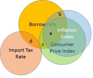
Multicollinearity as overlap in Venn diagrams.
Figure 1. Collinearity as overlap in Venn diagrams.

How does this make our regression solution unstable? Imagine we decide not to use II. The Venn diagram now looks like Figure 2. The regression coefficient of CPI will blow-up to the full credit it deserves. This will change our previous story about how CPI explains the borrow rate. If I were to remove the ITR instead, the coefficients of II and CPI would not have changed significantly. Thus in presence of multicollinearity among the predictor variables, neither do we get a stable solution, nor can we use it to properly interpret the underlying relationships.

Figure 2. Venn diagram for Multicollinearity without II.
Figure 2. Venn diagram for Collinearity without II.

Are you Sitting Comfortably?

Which chair would you rather sit on? Me too. In [2] we can find another great visual insight into how multicollinearity impacts the stability of LSR.

chairs

A scatter plot of two uncorrelated variables looks like a sea of data points. A scatter plot of two highly correlated variables looks more like a straight line. A regression solution will fit a hyperplane through the data points and the more spread-out the data points are, the more stable is the shape and direction of the best fit hyperplane. If, however, the data is align in a straight line, the best fit plane can be at any angle, depending on which target point it has to go through.

Figure 3. Fitting a hyperplane through data points.

Figure 3 above shows that the uncorrelated data points act like anchors for the left hyperplane. In case of strongly correlated II and CPI where the data points are in a line, there are no anchors for the sides and corners of the right plane, and it will “tilt” into the direction of whichever BR point it has to go through.

Summary and Conclusion

I hope you have found this visual insight into the impact of multi/collinearity revealing. I definitely did. To conclude, the presence of multicollinearity among the predictor variables in the least squares standard multiple regression does not invalidate the predictions generated by the fitted model. However, the stability of the model and its usefulness in telling the story about the model parameters is compromised.

References:
[1]. Using Multivariate Statistics. Barbara Tabachnick and Linda Fidell. 2013, 6th edition. Pearson.
[2]. Online Statistics course STATS501. https://onlinecourses.science.psu.edu/stat501/

Notes:

(a) In practice, the total coefficients weight assigned to CPI and II will approximately reflect the entire a+b+c area. If CPI and II both have the same real contributions, the individual weights assigned by the regression may depend on the order of data columns (i.e. does CPI appear before II) that is used to fit regression model, with the first predictor receiving the greatest weight. By “lost to standard error” I mean the dependence on these random factors like order, as well as an overall increase in the standard error of CPI and II regression coefficients.

Test-Driven Data Analysis (and its possible application to the LS Regression)

I have recently attended a PyData meetup in London where Nicolas Radcliffe gave a nice talk on the concept of Test-Driven Data Analysis (TDDA). Here is a link to the slides that he presented.

Essentially, the idea behind TDDA is born from a well-known idea of Test Driven Software Development (TDSD or simply TDD). In TDSD, the test cases are written before the core code. This is often done to avoid developing solutions for specific scenarios and missing the edge cases. Take for example division. Everyone (hopefully) provides for division by zero, but what about integer division when a floating number is expected? How many times have you been caught out by this in a dynamic programming language like Python, staring at the code and wondering why every number comes out as zero? Developers who use TDSD specify at the start what the code should behave like and the constraints placed on the results.

Right now the practice of data science and data analysis very much lacks the structure of TDSD. I liked Nicolas’s 5th slide where he schematically shows the pillars of the data scientist’s workflow: trying, eyeballing and trying again until it makes sense. However, each stage of data analysis is prone to error. Starting from choosing the modelling approach down to interpretation of the results. Errors can be made in data pre-processing, model implementation, output gathering and even when plotting graphs. One of the main points of the talk was reproducible research. If every analysis is wrapped in a verification procedure that ensures that the same outputs are produced for the same inputs, then analysis bugs can be greatly reduced.

Another strong point of the talk was about using constraints. Much of the test-driven software development relies on constraints placed on the allowed inputs&outputs. In the data analysis, such constraints can be placed on data types, data value ranges, legality of duplicates, or even statistical and distributional properties. For example, can a value of an insurance claim be negative? What about a negative correlation between the insurance costs and the values of the claim?

I am hugely in favor of everything that makes software development more disciplined and the final result more robust. Thus you can see why I liked Nicolas’s ideas so much. It made me think about how and where I can incorporate TDDA in my work. Let’s take the work horse of data science – the least squares (standard multiple) regression. Can TDDA safeguard from common mistakes of applying regression and interpreting its results? I think it can. The quality of regression analysis and the ability of reproducing and reusing the regression model results will depend on the following parameters, all of which can be the constraints of TDDA:

  • Inputs: number of input cases vs. the number of independent variables: too many or too few input cases can invalidate regression analysis. When the number of input variables is small compared to the number of independent variables (i.e. the attributes of regression), the regression converges on perfect but meaningless solution. Another possibility is that the variance-covariance matrix can be non-invertable. Alternatively, when one tries to fit regression to too much data, almost any amount of correlation between the dependent and the independent variable can become statistically significant. A large number of false positives is an unfortunate side-effect of big data used in the wrong way. A possible constraint can be a simple check if the number of cases is ≥ 50 + 8 * ‘# of independent variables’.
  • Inputs: presence of singularity and multicollinearity: two regression attributes are singular if one of them is redundant (e.g. age and year of birth). Multicolliniear attributes are highly correlated, and in the case of standard multiple regression (as opposed to the step-wise regression, for example), can significantly impact/reduce the regression coefficients.
  • Inputs: presence of outliers: everyone knows what outliers can do to the statistics like the mean and standard deviation. Likewise, outliers can significantly impact the coefficients of regressions. A constraint on outliers absence can be placed on the data.
  • Output: normality and linearity of residuals: if regression was performed on non-transformed data, the residuals should always be examined. Skewed residuals may point to absence of normality in the input data, and non-normal input data may invalidate your prediction intervals if regression model is used to make predictions. Non-linear residuals may indicate that the originally suggested linear relationship between the dependent and the independent variables is inaccurate. Absence of normality is often dealt with data transformations (e.g. taking square roots or logarithms). Non-linearity will require re-visiting the original model (e.g. squaring or cubing the attributes).
  • Output: homoscedasticity of residuals: the absence of homoscedasticity between the error and the predicted variable may occur if the response is related to some transformation of the dependent variable instead of its original form. In other words, the relationship of the two variables varies over time. For example, the relationship between age and income is very likely to have this non-linear shape, since income of young people varies less than income of people who are over forty. I should note that the presence of heteroscedasticity does not invalidate regression results, but it may weaken the strength of its interpretation. Again, data transformation can come to the rescue (e.g. taking the logarithm).

Here you go – we have come up with five constraints that can be placed on regression input and output to ensure robust data analysis. Luckily most analytical platforms like SAS or SPSS have built-in checks that flag when these constraints are not satisfied. But in case if you are playing with a regression tool from another package – watch out. There is no need to increase that figure of 90% (see slide # 10)…

samplepy – a new Python Sampling Package

Hello my blog readers,

This post is to introduce a new Python package samplepy. This package was written to simplify sampling tasks that so often creep-up in machine learning. The package implements Importance, Rejection and Metropolis-Hastings sampling algorithms.

samplepy has a very simple API. The package can be installed with pip by simply running pip install samplepy. Once installed, you can use it to sample from any univariate distribution as following (showing rejection sampling use):


from samplepy import Rejection
import matplotlib.pyplot as plt
import numpy as np

# define a unimodal function to sample under
f = lambda x: 2.0*np.exp(-2.0*x)
# instantiate Rejection sampling with f and required interval
rej = Rejection(f, [0.01, 3.0])
# create a sample of 10K points
sample = rej.sample(10000, 1)  

# plot the original function and the created sample set
x = np.arange(0.01, 3.0, (3.0-0.01)/10000)
fx = f(x)

figure, axis = plt.subplots()
axis.hist(sample, normed=1, bins=40)
axis2 = axis.twinx()
axis2.plot(x, fx, 'g', label="f(x)=2.0*exp(-2*x)")
plt.legend(loc=1)
plt.show()


Sample from f(x)=2.0*exp(-2*x) over [0.01, 3.0]

The three sampling method (i.e. Rejection, Importance and MH) are quite different and will achieve slightly different results for the same function. Performance is another important difference factor, with Metropolis-Hastings probably being the slowest. Let’s compare how the three sampling algorithm deliver on a bi-modal univariate function:

f(x)=exp(-x^{2})*(2+\sin(5x)+\sin(2x))


from samplepy import Rejection, Importance, MH
import matplotlib.pyplot as plt
import numpy as np


f = lambda x: np.exp(-1.0*x**2)*(2.0+np.sin(5.0*x)+np.sin(2.0*x))
interval = [-3.0, 3.0]
rej = Rejection(f, interval)  # instantiate Rejection sampling with f and interval
sample = rej.sample(10000, 1)    # create a sample of 10K points

x = np.arange(interval[0], interval[1], (interval[1]-interval[0])/10000)
fx = f(x)

figure, axis = plt.subplots()
axis.hist(sample, normed=1, bins=40)
axis2 = axis.twinx()
axis2.plot(x, fx, 'g', label="Rejection")
plt.legend(loc=1)
plt.show()

mh = MH(f,interval)
sample = mh.sample(20000, 100, 1)  # Make sure we have enough points in the sample!

figure, axis = plt.subplots()
axis.hist(sample, normed=1, bins=40)
axis2 = axis.twinx()
axis2.plot(x, fx, 'g', label="MH")
plt.legend(loc=1)
plt.show()

imp = Importance(f, interval)
sample = imp.sample(10000, 0.0001, 0.0010) # create a sample where essentially no extra importance is given to any quantile

figure, axis = plt.subplots()
axis.hist(sample, normed=1, bins=40)
axis2 = axis.twinx()
axis2.plot(x, fx, 'g', label="Importance")
plt.legend(loc=1)
plt.show()

rejection
mhimportance

Hopefully this gives you enough examples to get you started using samplepy!